Customize the My Account UI
This section explains how we can customize the theming of My Account application.
Change the default theme to dark mode
A customized version of the default theme in the Semantic UI LESS package has been used to achieve the look and feel of the My Account.
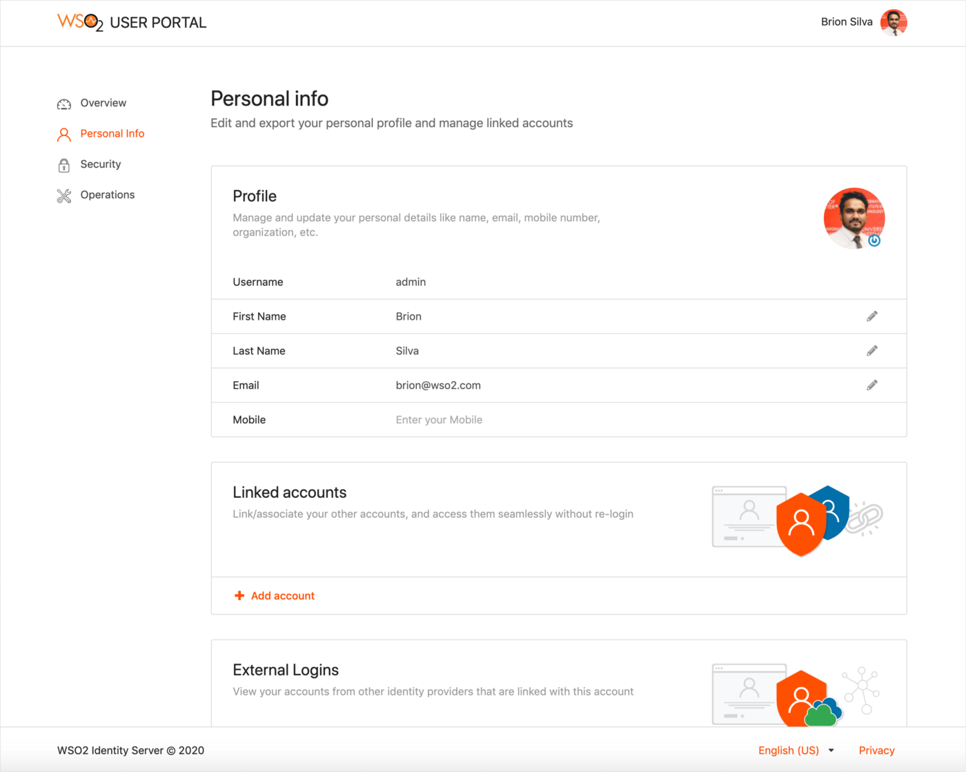
For information on the Semantic UI theming, see Semantic UI documentation.
Before you begin
-
Check out the corresponding identity apps source code from the identity-apps repository.
-
Check out the latest tag of the identity-apps. For example, the
v1.4.28tag is used in the sample mentioned below.$ git fetch --all --tags --prune $ git checkout tags/v1.4.28 -b feature-dark-theme-demo -
Navigate to the
modules/theme/src/themesfolder within identity-apps. All the theme global variable overrides can be found in themodules/theme/src/themes/default/globals/site.variablesfile. For the full set of variables, see the original theme variables file.
Follow the steps given below to further customize My Account application.
Step 1: Change the primary color of My Account
In order to change the primary color of the My account application, the variables in site.variables need to be overridden.
-
Add a new color under the site colors and name it. In this example it is named,
facebookBlue./*------------------- Site Colors --------------------*/ @facebookBlue : #2d88ff; -
Now change the primary color variable.
/*------------------- Brand Colors --------------------*/ @primaryColor : @facebookBlue; -
Next, change the page background color and text color. In this example, the background color is changed from white to dark gray and the default text color is changed to a lighter shade. Add a new variable under the brand colors. It is called
globalBackgroundColorin this example./*------------------- Brand Colors --------------------*/ @globalBackgroundColor: #18191a; -
Override the
@pageBackgroundvariable./*------------------- Page --------------------*/ @pageBackground : @globalBackgroundColor; @textColor : #e4e6eb; -
Build the theme module by running the following command and check the results reflected on the dev server.
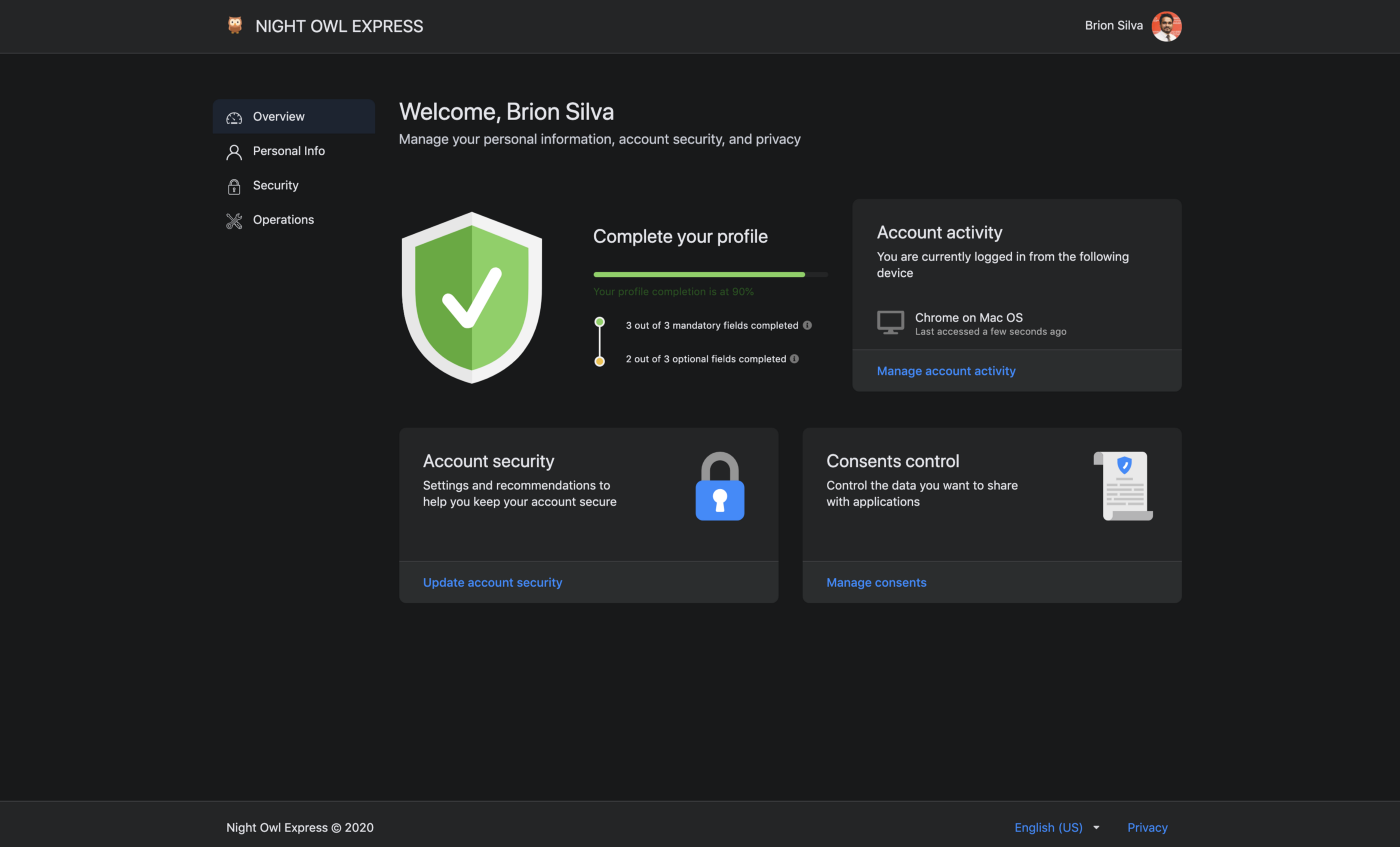
The response should be similar to the screenshot given below.# from inside `modules/theme` $ npm run build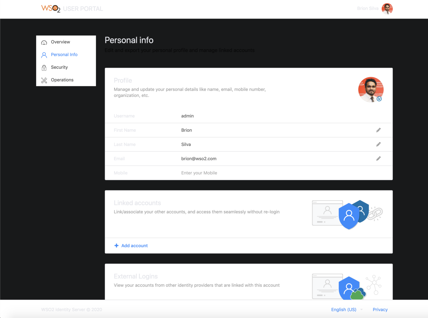
As seen in the image above, the background color of the header, footer, side navigation, and content cards can be changed.
-
In order to change the header and footer background colors, add a new variable to the
modules/theme/src/themes/default/collections/menu.variablesfile under the brand, "colors". This variable is namedglobalForegroundColorin this example.@background: @globalForegroundColor; -
Change the side panel background in the
modules/theme/src/themes/default/collections/menu.overridesfile..ui.vertical.menu { &.side-panel { background: @globalBackgroundColor; // Other styles } } -
Modify the content card background color in the
modules/theme/src/themes/default/views/card.variablesfile.
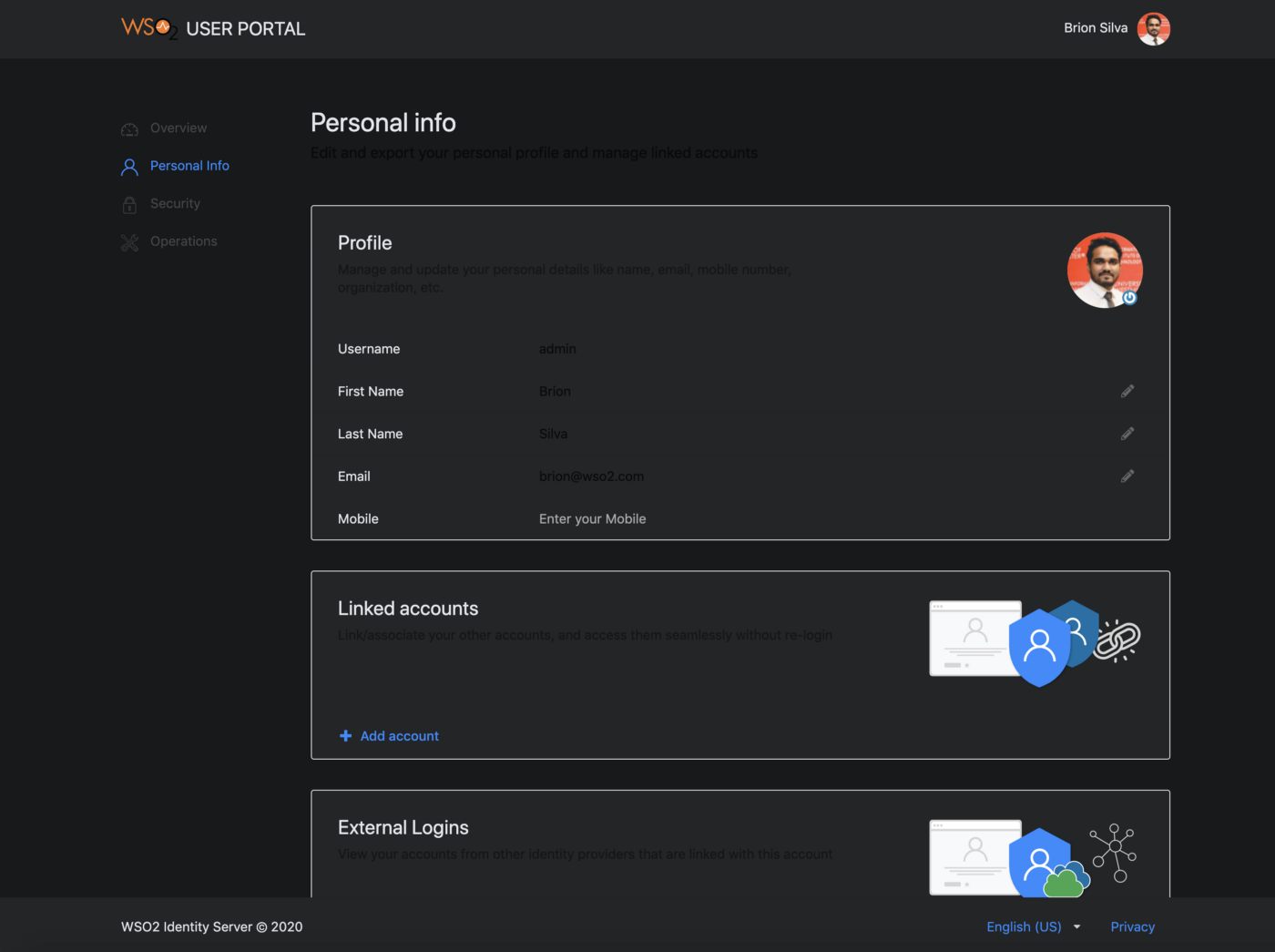
The status can be checked by rebuilding the theme module. The changes should be reflected on the running dev server in no time. A sample screen of the new theme is shown below.@background: @globalForegroundColor;
Step 2: Change the branding
Now that the styling is complete, the following steps explain how the product branding can be changed.
Change the product logo
Use one of the following methods to change the product logo.
Method 1 (Recommended)
If the logo should be changed without touching the compiled javascript bundle, follow these instructions to override the existing MWARE IAM logo using CSS.
-
Download an icon from any of the providers such as Flaticon.com. In this example,
owl.svgwas the downloaded icon. Now add it to themodules/theme/src/themes/default/assets/imagesfolder. -
Open the
modules/theme/src/definitions/globals/product.lessfile and replace the existing styles in the.product-logoclass with the following..product-title { .product-logo { width: 25px; height: 25px; vertical-align: text-top; margin-right: 5px; background: url(assets/images/owl.svg) no-repeat; background-size: auto; svg { display: none; } } // Other styles }
Method 2
-
Download an icon from any of the providers such as Flaticon.com. In this example,
owl.svgwas the downloaded icon. Now add it to themodules/theme/src/themes/default/assets/imagesfolder. -
Open the
modules/theme/src/index.jsfile and replaceLogowith the path to the new icon.
3. Build my-account artifacts.export const Logo = require("https://iam-docs.m-ware.eu/en/6.1.0/lib/assets/images/owl.svg");npx lerna run build — scope @wso2is/my-account -
Copy the
main.jsandmain.js.mapfiles from theapps/my-account/build/my-accountfolder and paste it inside the my-account web app found in the<IS_HOME>/repository/deployment/server/webapps/my-accountfolder. -
To change the product title & copyright, add the following entries to the
runConfigwindow object in the<IS_HOME>/repository/deployment/server/webapps/my-account/index.jspfile.window["runConfig"] = { ... applicationName: "NIGHT OWL EXPRESS", copyrightText: "Night Owl Express © 2020" }; -
Replace
favicon.icoin the<IS_HOME>/repository/deployment/server/webapps/my-accountfolder with the desired icon.Tip
If you do not have a favicon already, you can use an online generator like favicon.oi to generate a favicon for free.
-
Change the
<title>tag in the<IS_HOME>/repository/deployment/server/webapps/my-account/index.jspfile.<title>Night Owl Express</title>
Step 3: Deploy the changes in the web app
The final step of the process is the deployment. Follow the sequence of steps listed below to deploy the changes performed in the previous steps.
-
Build the theme module.
# from inside modules/theme $npm run build -
Copy the built artifacts available inside the
modules/theme/libfolder. Navigate to the<IS_HOME>/repository/deployment/server/webapps/my-account/libs/styles/cssfolder and paste the copied resources.Warning
Make sure that you keep a backup of the original CSS folder.
The final theme should look similar to following.